What is an “x-height”?
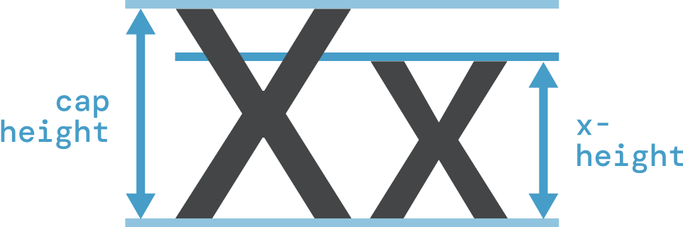
An x-height is the height of a lowercase letter (like the letter x). It is given as a percentage of the cap height, which is the height of an uppercase letter (like the letter X). For example, Inter has an x-height of 76%.
How can I use x-heights for font pairing?
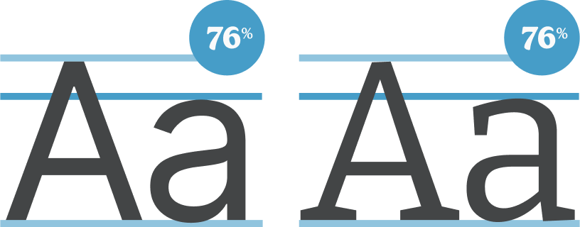
Fonts with similar x-heights will have similar proportions so should work well together. Inter and Bitter have a have the same x-height so are a great match.
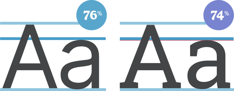
The two x-heights don’t have to be exactly the same - a difference of a few percentage points is fine. Inter and Roboto Slab have a two percent difference in x-height but are still a great pairing.
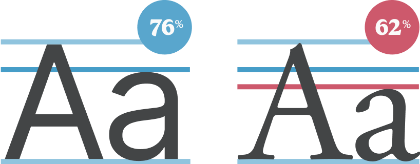
The bigger the difference, the more likely it is that the two fonts won’t work together. Inter and Garamond have a 16% difference in x-height so aren’t the best pairing.
How can I find fonts with matching x-heights?
So far, it has been difficult to find fonts with matching x-heights. Although this is commonly suggested as a way to pair fonts, x-heights are poorly documented and the process often involves trial and error.
This is made harder by the fact that the cap height varies from font-to-font - from 50 to 80 percent of the overall font size. This makes finding the relative x-height difficult as you need to normalize the cap heights first.
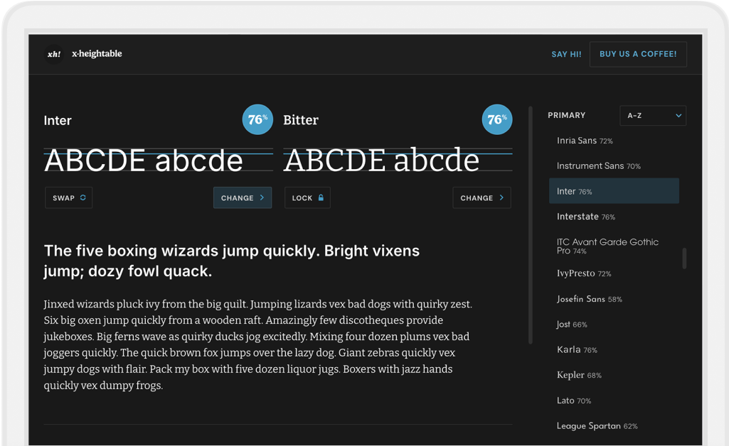
xheightable is a free tool that documents the x-heights of over 150 of the most popular fonts from Google and Adobe. It then suggests pairings based on the font’s x-height, making it easy to find the perfect pairing.
What about line heights?
The suggested line height is usually given at 150% for paragraph text. However, this is only appropriate for fonts with a cap height and x-height of around 70%. Fonts with larger proportions will need more spacing, fonts with smaller proportions will need less.
xheightable documents the suggested paragraph line height for every font, taking into account both the cap height and x-height.
What else should I consider when pairing fonts?
x-height is only one thing to consider when pairing fonts. Here are some other things to take into account.
Letter widths
Sometimes fonts can look better paired when the overall widths of the letters are similar. Some variable fonts allow you to manually adjust the widths of the fonts (never stretch or compress the width of a font any other way!)
Color or weight
Sometimes fonts can look better paired when the overall weight or colour of the letters are similar. Some variable fonts allow you to manually adjust the weight of fonts.
Character
Fonts will look better paired if the respective character of the two fonts are aligned. Make sure fonts with a strong character (e.g. technical, elegant or quirky) are aligned with other fonts with a similar character or a font with a neutral character (e.g. Helvetica or Georgia). It is usually best to use more characterful fonts for headings and accents, and more neutral fonts for body text.